Google Translate
Navigation
New Content Alerts
User login
Recent Stories
-
August 25, 2017, 2:58 pm
-
August 23, 2017, 3:13 pm
-
March 13, 2017, 4:11 pm
-
December 19, 2016, 12:00 pm
-
December 13, 2016, 12:09 pm
The Cycle of Life
The story of carbon dioxide, the essential life-giving gas that feeds all life. Contrary to everything we have been told, our planet is currently suffering a carbon famine, with deadly consequences for the poor and for wildlife.
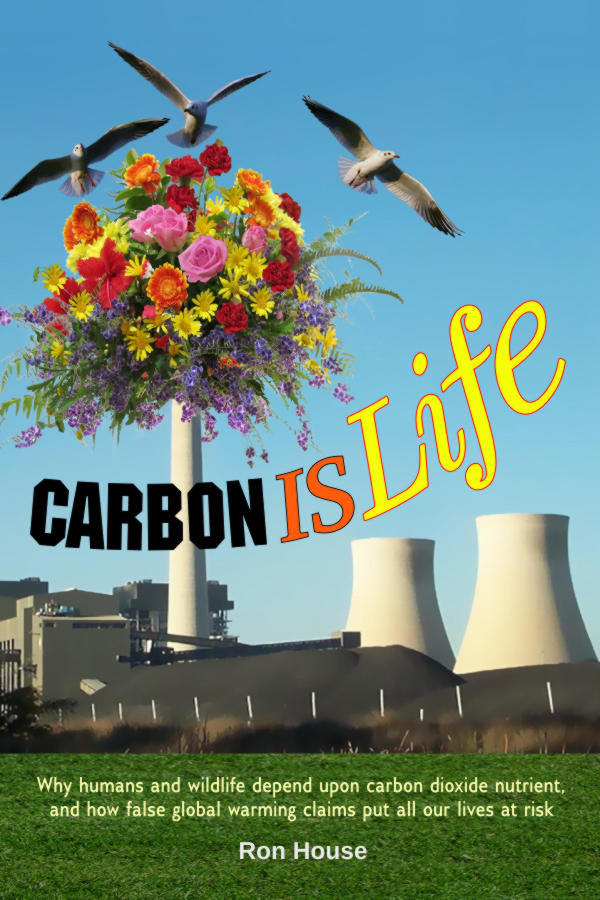
This is the book every environmentalist and lover of wildlife really needs to read! (Click to read more.)
Climate Research
For researchers: How to download BOM historic temperature data.
FeedBurner Email Alerts
Peace Legacy feeds
Get the Book
Free E-book

at the site that is all about the Principle of Goodness principleofgoodness.net
Recent comments
9 years 22 weeks ago
9 years 33 weeks ago
9 years 33 weeks ago
9 years 33 weeks ago
9 years 33 weeks ago
9 years 35 weeks ago
9 years 35 weeks ago
9 years 35 weeks ago
9 years 35 weeks ago
9 years 35 weeks ago